You stare at a screen filled with jagged lines, colorful bars, and moving averages. It looks like noise. But for traders, this visual chaos tells a story about money flowing in and out of an asset. This is the power of reading spot price charts, which are visual representations of real-time or historical financial asset prices used to identify trends and trading opportunities. Whether you are tracking Bitcoin, Ethereum, or traditional stocks, understanding these charts is not just a skill; it is a necessity for anyone wanting to make informed decisions in volatile markets.
Most beginners think charting is about predicting the future with crystal-ball accuracy. That is a myth. Instead, charting is about probability and psychology. It captures how buyers and sellers feel at any given moment. When you learn to read these signals, you stop guessing and start reacting to data. This guide will break down the core components of spot price charts, explain the different types of charts you will encounter, and show you how to use key indicators to find entry and exit points.
The Building Blocks: OHLC Data
Before diving into complex patterns, you need to understand what the chart is actually showing you. Every bar or candle on a chart represents a specific time period-whether that is one minute, one hour, or one day. Within that period, four critical pieces of data are recorded. This framework is known as OHLC, which stands for Open, High, Low, and Close prices.
- Open: The price at the very beginning of the time period.
- High: The highest price reached during that period.
- Low: The lowest price reached during that period.
- Close: The final price at the end of the period.
These four numbers tell you everything about the battle between buyers (bulls) and sellers (bears) during that timeframe. If the close is higher than the open, buyers won that round. If the close is lower, sellers took control. Understanding this basic dynamic is the foundation of all technical analysis.
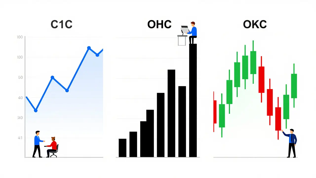
Choosing Your Chart Type
Not all charts look the same. You will primarily encounter three types: Line, Bar, and Candlestick. Each serves a different purpose, and choosing the right one depends on your trading style.
| Chart Type | Data Displayed | Best For | Limitations |
|---|---|---|---|
| Line Chart | Closing prices only | Long-term trend identification | Hides intraday volatility and range |
| Bar Chart | OHLC (Open, High, Low, Close) | Detailed price action analysis | Less intuitive visually than candlesticks |
| Candlestick Chart | OHLC with color coding | Identifying sentiment and momentum | Can generate false signals in low volume |
Line charts are the simplest. They connect closing prices with a single line. While they are great for seeing the big picture over months or years, they hide the drama of daily fluctuations. Most active traders avoid them because they miss crucial details.
Bar charts provide more depth. They show the full range of price movement with vertical lines and ticks for open and close. However, they can be harder to read quickly because they lack color cues.
Candlestick charts are the industry standard for a reason. Originating from Japanese rice traders in the 18th century, they offer immediate visual feedback. A green (or white) candle means the price closed higher than it opened (bullish). A red (or black) candle means it closed lower (bearish). The "body" of the candle shows the open-to-close range, while the "wicks" or "shadows" show the high and low. Large bodies indicate strong momentum, while long wicks suggest rejection at certain price levels.
Understanding Timeframes
A common mistake new traders make is ignoring the timeframe. A pattern that looks bullish on a 5-minute chart might be completely bearish on a daily chart. The timeframe you choose should match your trading goals.
- Scalpers and Day Traders: Use 1-minute, 5-minute, or 15-minute charts. They are looking for quick moves and need granular data. According to recent market data, short-term traders execute nearly 70% of their trades on these intervals.
- Swing Traders: Prefer 4-hour, daily, or weekly charts. They hold positions for days or weeks, so they need to filter out the noise of minute-by-minute fluctuations.
- Long-Term Investors: Look at monthly or yearly charts. They care about the macro trend, not the daily dip.
Pro tip: Always use multi-timeframe analysis. Check the daily chart to determine the overall trend, then drop down to the 1-hour or 15-minute chart to find a precise entry point. Never trade against the higher timeframe trend unless you have a very strong reason.
Key Patterns to Watch
Once you can read individual candles, you start seeing patterns. These formations repeat because human psychology remains consistent. Fear and greed drive markets, and these emotions create recognizable shapes on charts.
Support and Resistance
Think of support as a floor and resistance as a ceiling. Support is a price level where a downtrend tends to pause due to a concentration of demand. Resistance is a price level where an uptrend tends to pause due to a concentration of supply. A valid support level must be tested at least twice with bounces exceeding 1.5%. If price breaks through support, it often becomes new resistance. Conversely, breaking through resistance turns it into new support.
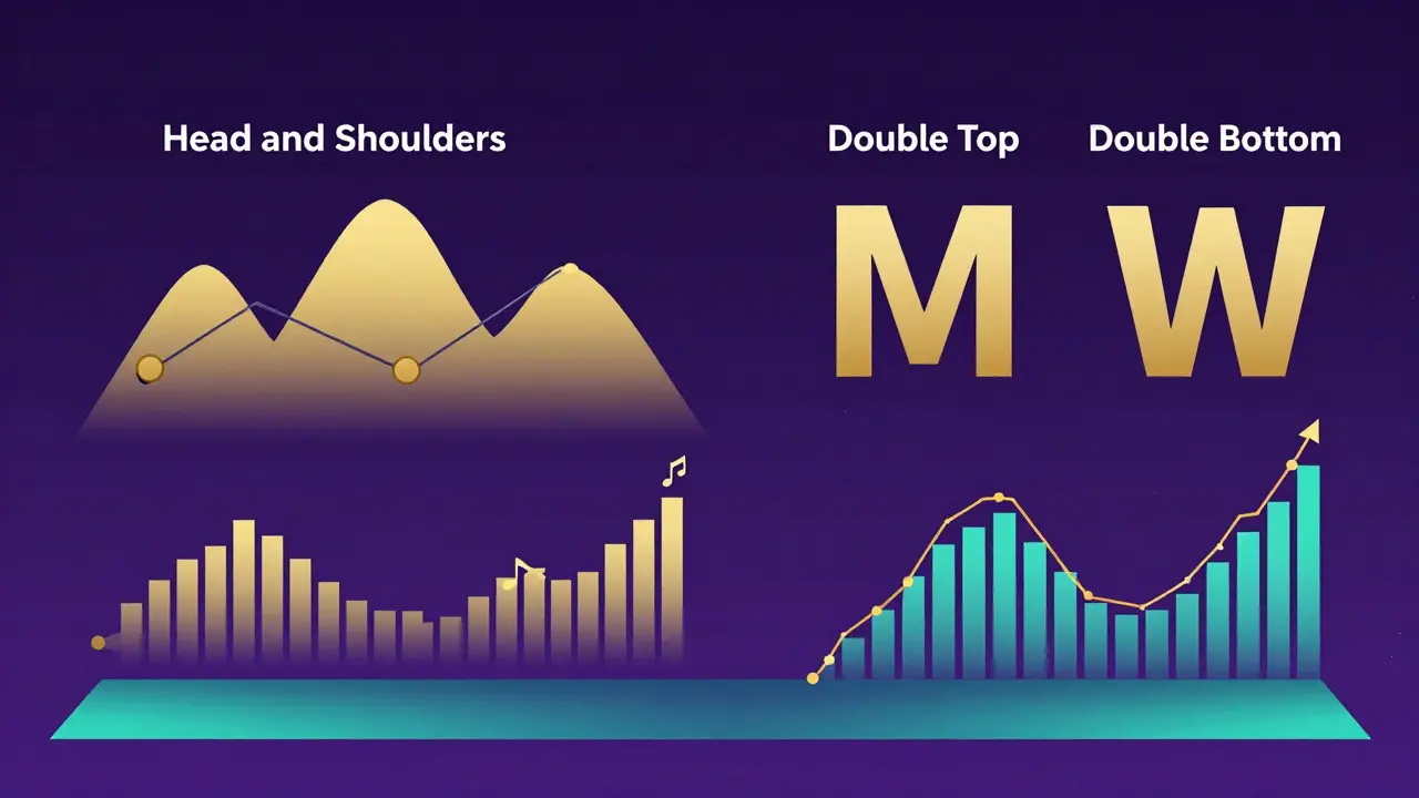
Common Reversal Patterns
Reversal patterns signal that the current trend might be ending. Two of the most reliable are:
- Head and Shoulders: This pattern consists of three peaks. The middle peak (head) is the highest, flanked by two lower peaks (shoulders). When the price breaks below the neckline connecting the shoulders, it often signals a significant downward move. Studies show this pattern has a high success rate when accompanied by increased volume.
- Double Top / Double Bottom: A double top looks like an "M" and signals a potential reversal from up to down. A double bottom looks like a "W" and signals a reversal from down to up. For a double top to be valid, the second peak should fail to exceed the first by less than 0.5%, and volume should decline on the second peak.
Continuation Patterns
These patterns suggest the trend will continue after a brief pause. Triangles and flags are common examples. An ascending triangle, for instance, has a flat top (resistance) and rising bottoms (higher lows). When the price finally breaks above the resistance, it often surges upward.
The Role of Volume
Price tells you what happened; volume tells you how strong the conviction was. You cannot effectively read spot price charts without looking at volume. A price breakout with low volume is suspect-it might be a "fakeout." A breakout with high volume confirms that big players are involved.
If you see a massive green candle but the volume bar is tiny, be cautious. The move lacks fuel. Conversely, if price drops slightly but volume spikes, it could indicate accumulation (smart money buying before the next rally).
Adding Indicators for Confirmation
While price action is king, indicators can help confirm your ideas. Don’t clutter your chart, but using one or two can add clarity.
- Moving Averages (MA): These smooth out price data to create a single flowing line. The 50-day and 200-day MAs are widely watched. When the shorter MA crosses above the longer MA, it’s called a "Golden Cross" and signals bullishness. A cross below is a "Death Cross," signaling bearishness.
- Relative Strength Index (RSI): This oscillator measures the speed and change of price movements. It ranges from 0 to 100. An RSI above 70 suggests the asset is overbought (due for a pullback), while an RSI below 30 suggests it is oversold (due for a bounce).
Remember, indicators lag behind price. They are tools for confirmation, not prediction. Always prioritize price action and volume first.
Common Pitfalls to Avoid
Even experienced traders fall into traps. Here are the most common ones:
- Ignoring Market Context: A perfect chart pattern can fail if there is major news, like a regulatory crackdown or a macroeconomic event. Always check the broader market environment.
- Overfitting: Trying to find patterns everywhere. Not every wiggle in the chart is a signal. Wait for confirmed patterns with clear structure.
- Lack of Risk Management: Reading charts doesn’t protect you from losses if you don’t use stop-losses. Always define your exit strategy before entering a trade.
Learning to read spot price charts takes practice. Experts suggest around 87 hours of deliberate practice to reliably identify patterns with 70% accuracy. Start with paper trading (simulated trading) to test your skills without risking real money. Over time, the noise will fade, and the signals will become clear.
What is the difference between a spot price and a futures price?
The spot price is the current market price for immediate delivery of an asset. Futures prices are agreed-upon prices for delivery at a future date. Spot charts reflect real-time supply and demand, while futures charts include expectations of future events and interest rates.
Which chart type is best for beginners?
Candlestick charts are generally recommended for beginners because they provide more information (OHLC) in an intuitive, color-coded format. They make it easier to visualize market sentiment compared to line or bar charts.
Do chart patterns work in cryptocurrency markets?
Yes, but with caution. Cryptocurrency markets are highly volatile and often driven by sentiment and news rather than fundamentals. While patterns like head-and-shoulders and triangles still appear, they may produce more false signals due to lower liquidity in smaller altcoins. Always combine patterns with volume analysis.
How many indicators should I use on my chart?
Less is more. Using too many indicators leads to "analysis paralysis" and conflicting signals. Most professional traders stick to 2-3 complementary indicators, such as a Moving Average for trend direction and RSI for momentum, alongside raw price action and volume.
Is technical analysis reliable for long-term investing?
Technical analysis can help with timing entries and exits, even for long-term investors. However, fundamental analysis (evaluating the project's technology, team, and utility) is more critical for long-term value. Many successful investors use a hybrid approach, combining both methods.
Write a comment